|
3) Multiple Bar Diagram:- This method
can be used for data which is made up of two or more components.
In this method the components are shown as separate adjoining bars.
The height of each bar represents the actual value of the component.
The components are shown by different shades or colors. Where changes
in actual values of component figures only are required, multiple
bar charts are used.
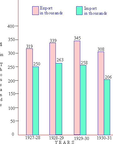
Illustration:- The table below gives data
relating to the exports and imports of a certain country X ( in
thousands of dollars ) during the four years ending in 1930 - 31.
Year Export Import
1927 - 28 319 250
1928 - 29 339 263
1929 - 30 345 258
1930 - 31 308 206
Represent the data by a suitable diagram
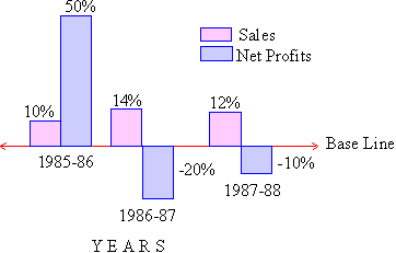
4) Deviation Bar Charts:- Deviation bars
are used to represent net quantities - excess or deficit i.e. net
profit, net loss, net exports or imports, swings in voting etc.
Such bars have both positive and negative values. Positive values
lie above the base line and negative values lie below it.
Illustration:-
|
Years |
Sales |
Net profits |
|
1985 - 86
1986 - 87
1987 - 88 |
10%
14%
12% |
50%
-20
-10% |
Present the above data by a suitable diagram showing the sales and net profits of private industrial companies.
|