3.7 Graphs
A graph is a visual representation of data by a continuous curve on a squared ( graph ) paper. Like diagrams, graphs are also attractive, and eye-catching, giving a bird's eye-view of data and revealing their inner pattern.
Graphs of Frequency Distributions:-
The methods used to represent a grouped data are :-
1. Histogram
2. Frequency Polygon
3. Frequency Curve
4. Ogive or Cumulative Frequency Curve
- Histogram :- It is defined as a pictorial representation
of a grouped frequency distribution by means of adjacent rectangles,
whose areas are proportional to the frequencies.
To construct a Histogram, the class intervals are plotted along the x-axis and corresponding frequencies are plotted along the y - axis. The rectangles are constructed such that the height of each rectangle is proportional to the frequency of the that class and width is equal to the length of the class. If all the classes have equal width, then all the rectangles stand on the equal width. In case of classes having unequal widths, rectangles too stand on unequal widths (bases). For open-classes, Histogram is constructed after making certain assumptions. As the rectangles are adjacent leaving no gaps, the class-intervals become of the inclusive type, adjustment is necessary for end points only.
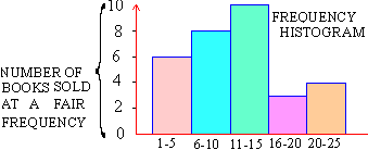
For example, in a book sale, you want to determine which books were most popular, the high priced books, the low priced books, books most neglected etc. Let us say you sold a total 31 books at this book-fair at the following prices.
$ ....2, $ 1, $ 2, $ 2, $ 3, $ 5, $ 6, $ 17, $ 17, $ 7, $ 15, $ 7, $ 7, $ 18, $ 8, $ 10, $ 10, $ 9, $ 13, $ 11, $ 12, $ 12, $ 12, $ 14, $ 16, $ 18, $ 20, $ 24, $ 21, $ 22, $ 25.
The books are ranging from $1 to $25. Divide this range into number of groups, class intervals. Typically, there should not be fewer than 5 and more than 20 class-intervals are best for a frequency Histogram.
Our first class-interval includes the lowest price of the data and, the last-interval of course includes, the highest price. Also make sure that overlapping is avoided, so that, no one price falls into two class-intervals. For example you have class intervals as 0-5, 5-10, 10-15 and so on, then the price $10 falls in both 5-10 and 10-15. Instead if we use $1 - $5, $6=$10, the class-intervals will be mutually exclusive.
Therefore now we have distribution of books at a book-fair
|
Class-interval |
Frequency |
|
$ 1- $ 5
$6 - $10
$11 - $15
$16 - $20
$21 - $25 |
6
8
10
3
4 |
|
Total |
n = S
fi = 31 |
Note that each class-interval is of equal width i.e. $5 inclusive. Now we draw the frequency Histogram as under.
|
Index
3.1 Introduction
3.2 Comparison Between Tabular And Diagrammatic
Presentation
3.3 Difference Between Diagrams And Graphs
3.4 General Principles Of Constructing Diagrams
3.5 Bar Diagrams
3.6 Pie Chart
3.7 Graphs
3.8 Box and Whiskers
Chapter 4
|